

Thank you for loving our doll.
In addition to the newly integrated website, there has been another big change for Soom Korea, which is the rebranding of Soom Korea.
Since its establishment in 2002, Soom Korea is a doll brand that has delivered inspiration to 69 countries around the world with ball-jointed dolls that combine creative technology and artistic sensibility.
With the passion and support of many doll lovers and the changing times, dolls are now recognized as a medium for sharing emotions and a work of art beyond simple toys. In line with this trend, we have rebranded to establish the identity of each brand centered on the main Soom brands. This change is a challenge to communicate more deeply with customers based on Soom’s core values of inspiration and communication, sensibility and technology, innovation and creativity, and to take a step further as a global doll art brand.

SOOM’s CI Design
Soom Korea’s new symbol is a sensual reinterpretation of the formative beauty of the alphabets that make up the brand name, visualizing a friendly yet future-oriented brand image, and the logo font expresses the brand’s innovation with a modern sensibility. The newly completed CI design symbolically contains the vision of a global company that provides deeper impressions to customers and grows together with fans around the world based on Soom’s core values of imagination, technology, and artistry.

THE GEM’s BI Design
THE GEM’s logo captures the essence of a high fantasy doll brand that creates unique characters inspired by ancient myths and legends. The logo symbolizes mystery and transcendent presence through refined geometric shapes and sharp details, and is designed with a structure reminiscent of old relics or traces of civilization. This design visually symbolizes the narrative of THE GEM’s high fantasy worldview..

IDEALIAN’s BI Design
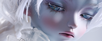
IDEALIAN’s logo reflects the characteristics of a doll brand with a dark fantasy concept that captures more human and vivid emotions through hyper-realistic expressions. The logo visualizes the knots of human emotions through restrained serifs and subtle curves, and the heavy and stable typography captures the realistic sculptural beauty and emotional lines of the doll. This design, which creates a dark yet delicate atmosphere, simultaneously captures the layers of emotion, reality, and the gentle tension of dark fantasy.

NEOR’s BI Design
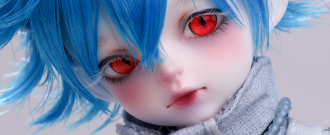
NEOR’s logo contains the brand identity that reinterprets pure imagination in a dreamy Märchen style. The pure and comfortable curves and sometimes straight lines that imply bold and daring individuality harmoniously blend to express NEOR’s free imagination and strange charm at the same time. This subtly reveals NEOR’s unique worldview where lovely and mysterious characters live and breathe.
That’s all we have introduced the newly rebranded logo of Soom Korea. We ask for your continued interest and support for Soom’s new challenges and changes.
SOOM